Month: August 2022

Blu-Buried: Design for Living (The Criterion Collection)

Gilda Farrell (Miriam Hopkins) a commercial artist is on a train to Paris. She stumbles upon two sleeping artists, one a painter George (Gary Cooper) and one a playwright Tom (Fredrick March). While they sleep Gilda draws them. This starts a platonic relationship with the men where they agree to live in an apartment together.

Both George and Tom love Gilda, but she refuses to have sex with either of them. When Tom’s play is read and produced in London, Tom leaves. Gilda and George soon can’t resist their budding romance and with one the greatest lines ever, Gilda states, “it was a gentleman’s agreement, but I am no gentleman”.

Tom finds out by telegram that Gilda and George are now together. Tom returns to Paris to find Gilda and George have moved into a penthouse. When Tom finds Gilda alone, they rekindle their romance. George returns and the three must solve their predicament.

Funny, brilliant and a pre-code winner, Design for Living is a must watch. Miriam Hopkins lights up the screen with snappy dialogue and it’s easy to see why she is the object of desire for the two men. The idea of that this film was made in 1933 is mind blowing. With sexual innuendos sprinkled throughout it still packs laughs nearly 90 years after its debut.

Ernst Lubitsch cut his teeth for nearly 20 years before he directed Design for Living and already had a working relationship with Miriam Hopkins a year earlier with the witty Trouble in Paradise. Lubitsch would go on to direct some of the best comedies ever, including a personal favorite To Be or Not to Be. Here he is at comfort moving the film along quite nicely with some great shots, including a crane shot following Gilda and a bunch of school boys up a flight of stairs.

Grade: A+

Design for Living Video Quality

Design for Living boards the Criterion Collection with a pleasing, but not too great transfer. My guess is this film was not well preserved and Criterion did what they could with it.

It does look really great in some moments.The details and the closeups look really sharp. The last third of the film really has blemishes with a scratch present for about 20 minutes and other imperfections that pop up in the frame. It’s a shame that some films were not well preserved by their studios, Design for Living deserved better, the disc is still great but one longs for a flawless transfer that I am sure does not exist.

Grade: B

Design for Living Audio Quality

Design for Living makes it to the back of theater with a robust soundtrack. Although the audio track is only mono, it is crisp. Gone is most of the background hiss that can plague older films. Criterion cleaned the soundtrack up nicely with crystal clear dialogue well heard throughout the runtime.

Grade: A-

Design for Living Bonus Features

Joseph McBride: The Screenplay: A great interview with screenwriter Joseph McBride as he talks about the play and the film including their differences and similarities.

The Clerk: A short, funny segment starring Charles Laughton, directed by Lubitsch from the film, If I Had a Million.

Play of the Week-A Choice of Coward: 1964 British production of Design for Living. It’s introduced by the playwright of Design for Living, Noel Coward.

Selected Scene Commentary: Lubitsch biographer William Paul is on hand to discuss the film, totaling nearly 40 minutes.

Grade: A-

Funny, racy a must watch. Design for Living is a new Golden-Age favorite. I am a fan of Miriam Hopkins. She is funny and charming. Gary Cooper and Fredrick March always bring the goods, put all three together with one of the best directors around and you have a can’t miss blind-buy.

Overall: A-

The Great Sal Buscema: Spidey Super Stories

Happy Birthday Spidey! You’re 60 years young today! As the unofficial birthday of Spider-Man is celebrated today I thought I would share with you some of my most favorite covers and some pages from my most favorite Spider-Man artist Sal Buscema!

Most everybody (rightfully) will choose Steve Ditko, John Romita Sr and Jr, Gil Kane, Mark Bagley or Todd McFarlane as their favorite Spidey artist. And they would be right as well. For me however there is no better storyteller in comics than Sal. HIs lines are clean, his panels easy to follow and I fell in love with him when I first started collecting comics. In fact, I still own and remember my first comic book. It is The Spectacular Spider-Man #182, the fifth part of one of the greatest (and most underrated) Spider-Man stories ever, “The Child Within”. My dad bought it for me at Mile High Comics after I showed him my comic book card I got, Spider-Man vs. The Green Goblin. I love that comic and my copy is well worn. I’ve read it many times and study the story and the art. Of course my head couldn’t understand the incredibly deep story of abuse and betrayal at a young age, but Sal’s haunting art stayed with me.

So I ask you humble reader of this website or listener to my show, if you have never picked up a comic book illustrated by Sal Buscema, you really should. Not only has he drawn Spider-Man, but also his run on Hulk and The Defenders is legendary. Sal’s ability to tell a story visually is unmatched. It is the single most important aspect of a comic that is sometimes missing. Some artists draw beautifully, but if I can’t easily follow the story, what’s the point? On Sal’s art I cover the word balloons and follow the story visually, and Sal is the best at that. I am not alone in this assessment, J.M Dematteis stated on his website for The Spectacular Spider-Man 200 he had other plans then what ended up in the comic;

“ Then Sal’s pages came in: It was one of his finest hours. The panel flow was cinematic and crystal clear, the characters dramatic and achingly human. And those final two pages? Perfection! At first locked into my original vision I began writing captions and dialogue for the end-sequence, but it quickly became clear that everything I wanted to say had already been said, and better, by Sal” (do yourself a favor and checkout J.M. Dematteis’ website jmdematteis.com he posts some really great stuff there and he is an incredible writer making your journey there a grand one). I couldn’t have said it better.

Here are my favorite Sal Buscema Spider-Man covers and some pages, enjoy!

Captain America #137 (May 1971)

You want dynamic? You got it with Captain America and Falcon chasing after Spidey! One of the most iconic covers ever, the intensity is here and Sal’s ability to convey the story in a single image is ever so present. Falcon is after Spidey in this issue and when Falcon mistakes Harry Osborn as Spider-Man, it sets up an epic fight in the following issue.

The Spectacular Spider-Man 148 (March, 1989)

Spider-Man is always haunted by death. This ghoulish cover exploits that with Peter being haunted by two people that have died under his watch, Ned Leeds and his first love Gwen Stacy. The cover is the right amount of macabre and terror. The idea of two of your biggest mistakes returning from the grave is horrific, which Sal captures perfectly.

The Spectacular Spider-Man 156 (November, 1989)

Spider-Man fighting a monster hillbilly? Sign me up! The power of Banjo is conveyed in this dynamic cover. Also a fun note. I have an original art page from this issue, yes my love of Sal did not go unnoticed by my comic supplier Andrew. He got an original art page from this comic into his store and called me immediately. He only had it in his store for 45 minutes before he sold it to me. But he is such a good dude that he bought just for me and gave me one hell of a deal knowing that it would never leave me, until I am dead.

The Spectacular Spider-Man 179 (August 1991)

A rooftop battle between Spider-Man and Vermin is perfectly captured. The contrast of the two characters is on full display as Sal has Spidey in control of his stance, ready to fight. Vermin does not care and his animal instincts take over when he fights, his hunched posture and foaming at the mouth show an adversary not to take lightly.

Spider-Man vs. The Green Goblin, The Spectacular Spider-Man 189 (June 1992)

The almost climatic battle between former best friends, Harry Osborn and Peter Parker reaches its crescendo when Peter is tired of Harry’s incessant tormenting, of not only him but also his wife Mary Jane and Harry’s own family. Harry believe’s Peter only cares that he knows he’s Spider-Man. Peter doesn’t care. He tells Harry after he knocks him out cold that he’s dealt with worse. Meaning I have been dealing with you and your father issues and drug abuse for years, telling the world Spider-Man is Peter Parker doesn’t matter

The Spectacular Spider-Man 200 (May 1993)

One of the greatest comics ever. One of the greatest covers ever. Celebrating Spidey’s first 30 years, Marvel gave each of his core books cool covers with webbing in the background. Amazing had Spidey and Venom squaring off with gold webbing and Web of Spider-Man debuted a new Spider-Man costume, Spider-Armor with green webs. Spectacular had both beat, with an incredible story and art to match. Harry Osborn is my favorite Green Goblin. He is conflicted and his death is this issue is as heartbreaking as it is inevitable. The story that spanned over nearly two years of the Spectacular comic. Not only is the cover eye catching the art contained inside is just as jaw dropping.

The fight between Spider-Man and Green Goblin is brutal. Sal’s art makes you feel each punch, kick that each man delivers.

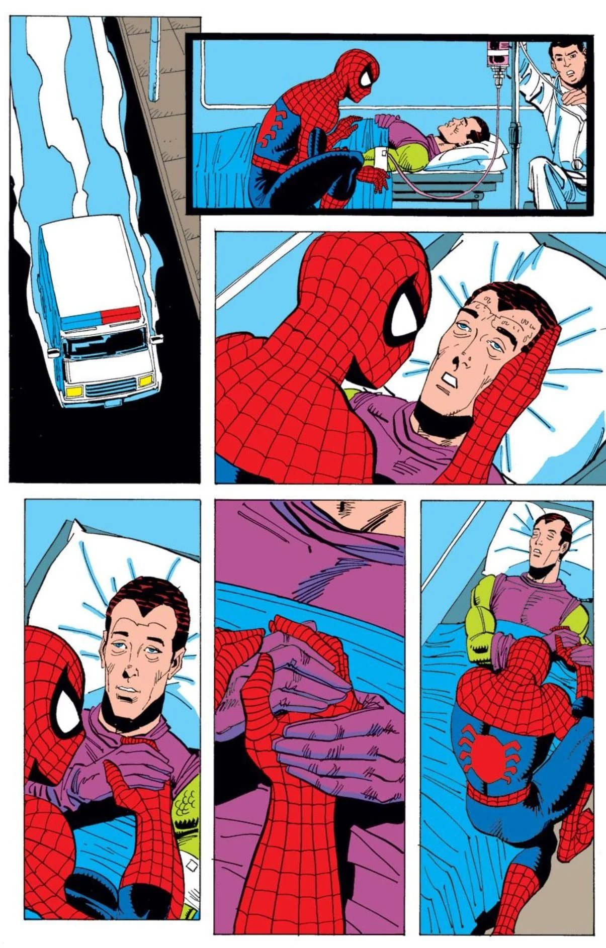
After leaving Peter to die, Harry doesn’t realize that his son, Normie is still in the house. So too is Mary Jane. Peter pleads with Harry to save them and leave him. Harry does.

When he brings Mary Jane and Normie to safety, Mary Jane screams at Harry, “And my husband is in there? You left Peter in there to die?!”

Harry saves Peter. But he can’t save himself. He dies from the effects of the Goblin Formula.

Sal’s art is so good that the last two pages have no dialogue. It’s not needed. The story is beautifully told through Sal’s art. My favorite panel is Mary Jane’s face when Peter puts his hand on her shoulder. Her pain and his pain is felt, and you can’t even see Peter’s face.

The Spectacular Spider-Man 218 (November, 1994)

The intensity of this cover is eye popping. Sal does so much with only two figures on the page. In this one cover you know Spider-Man is fighting for his life against Puma. His torn costume and his feet pushing the attacking enemy away convey a fight to the death. Man, this is a great cover.

The Spectacular Spider-Man 226 (July, 1995)

The idea of two Spider-Men squaring off is awesome. The execution of this issue however pissed me off. Peter is reveled as a clone and lame Ben Reilly is said to be the one “true” Spider-Man. It doesn’t take away from Sal’s incredible line work on this cover. I love how intense the image is again without seeing the faces of the Spider-Men. I love this cover, it is easily a top 5 for me. It just is so cool with just two figures.

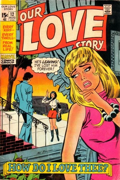
And to show Sal’s incredible versatility, here is an issue of Our Love Story, which I own because I love this cover and the story Sal tells.

Our Love Story 12 (August, 1971)

I hope you enjoyed some of my favorite Sal Buscema art. He’s my favorite Spider-Man artist and I hope that if you are discovering him for the first time he might be yours too.

Scroll to top